Most local government websites are designed as if their primary job is to look official. They emphasize department charts, rotating banners, proclamations, and organizational pride. None of that is inherently bad. But it often crowds out the thing the public actually needs: a fast, obvious path to the service or information they came for.
That is why so many city and authority websites feel frustrating even when they are technically “up to date.” The problem is not always outdated code or ugly design. More often, the site is organized around internal structure rather than user tasks.
1. A Local Government Website Is Public Infrastructure
Residents use a city website to solve problems:
- pay a bill,
- download a permit form,
- find a meeting agenda,
- contact the right person,
- check a deadline,
- or understand a local rule.
That means the website should be treated less like a marketing object and more like a public service system. If the public cannot reliably complete common tasks, the site is underperforming no matter how polished it looks.
2. Internal Department Logic Usually Fails Users
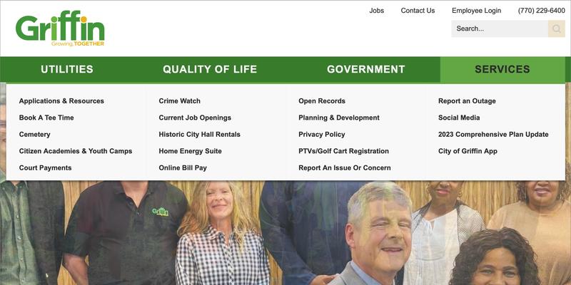
A frequent mistake is structuring navigation according to the org chart:
| Internal Logic | User Logic |
|---|---|
| Finance Department | Pay my utility bill |
| Community Development | Apply for a sign permit |
| Clerk’s Office | Find tonight’s agenda |
| Administration | Figure out who handles this issue |
The public usually does not know or care which department owns the workflow. They care whether the task is easy to find.
3. The Most Important Pages Are Usually the Least Glamorous
For most local governments, the pages that matter most are not the homepage slideshow or the mayoral welcome message. They are the pages that reduce friction:
- meeting and agenda pages
- payment and billing pages
- permit and form pages
- department contact pages
- plain-language service instructions
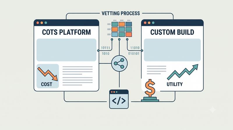
This overlaps directly with the procurement and governance discipline I laid out in How Local Government Boards Can Vet Software Vendors and Custom Builds. If a board is paying for a website, the contract should define success around task completion, findability, and maintainability, not around visual redesign alone.
4. Good Government Web UX Is Mostly About Clarity
Local government websites do not need to be flashy. They need to be clear.
That means:
- obvious navigation labels,
- strong search,
- up-to-date contact information,
- predictable document organization,
- mobile-friendly layouts,
- and fewer dead-end pages written in bureaucratic language.
A resident should not need insider knowledge to find a board packet or figure out which form applies to their project.
A city website organized around the org chart serves the organization. A city website organized around public tasks serves the public.
5. Better Sites Start With Better Questions
Before redesigning a government website, the more useful questions are:
- What are the top 20 public tasks the site should support?
- How many clicks does each one take?
- Which pages generate the most phone calls because the website failed to answer the question?
- Can staff update the site without technical bottlenecks?
That is where better public digital infrastructure begins. Not with aesthetics alone, but with a serious commitment to making government easier to use.
Frequently Asked Questions
They are often organized around internal departments and branding priorities instead of the tasks residents actually need to complete.
It should optimize for common public tasks such as paying bills, finding meeting information, submitting forms, and understanding who to contact.
Because poor digital access creates real friction for residents, businesses, and board members trying to use government services, comply with rules, or get timely information.